I'd like to point out that she's not sitting on the platform.
57 Art Reviews
19 w/ ResponsesBeautifully creative, gorgeously colored, utterly flawless... save for lulzy backdrop error.
I'm impressed with the amount of work and detail you put into this background. I do see a handful of problems though, everywhere I look on the page I see little corners that weren't filled in all the way, you may want to consider changing the Gap Size settings on the paint bucket tool to Don't Close Gaps.
You may also want to reconsider the tool you use for outlines since the Brush tool is a coloring tool & you seem to have trouble erasing outlines that cross into other outlines. You could erase a lot of those overcrossing outlines using the Line Tool with the Snap to Objects setting on; drag the the Line Tool outline over the affected area, break it and color over the stump you want to erase.
If you want the same visual effect you get with the Brush Tool, it can be done with the Pencil or Line Tool but the only drawback is it takes way longer, but you'll have more refined control of how each color-outline appears.
On the off chance that you're using the Eraser Tool, the Selection Tool is better if you want to delete elements that need to be chucked.
Your work reminds me a lot of a guy's content I enjoy, he's been around since 2004; his username 'round these parts is Noiserover. Be prepared, he has a penchant for disgusting humor.
Shouldn't she be sliding off of the Bulbasaur? I can see both buttcheeks so that means she's not actually sitting on anything, the leg she has tucked behind him must be broken. Did you get your layers mixed up or something?
Her other foot is level at a side shot but her toes are cocked sideways. You even have the ridge of her foot cutting through that lineup of toes like they really don't belong.
The Bulbasaur's face is completely flat and why is he looking to the top right of his vision but not turning his head to face the woman?
Mojabrantes responds:
You're right, I'll do better next time :)
Spines can't twist 75 degrees like that. Her breast is dangling over her right buttock. She could touch the front of her left thigh with her right arm by reaching behind.
AngelXMIkey responds:
I liked the reference I used, so I took some liberties to get a good booby to booty ratio. Sorry it bothered you so much not to get you off.
I know that it's a faux pas to criticize one of NG's biggest giants but I honestly have to say that your artwork has gotten worse over the years. Well I admit you've gotten much better at the finer details, your general form has gotten worse.
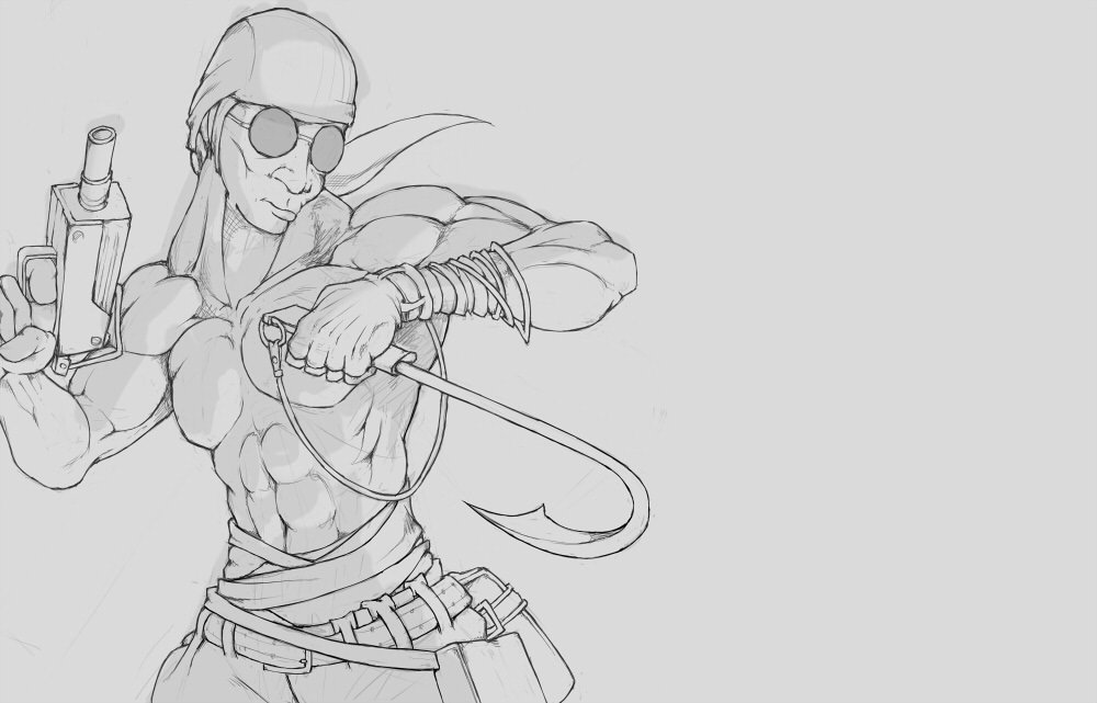
The first thing I want to point out is how his leg is angled, have you ever seen someone spread their thigh out by forty degrees with their shin & foot facing forward, as if he were extending his leg ahead of himself instead of the side? His pose is so unnatural and forced, legs do not pivot on their joints like that. It wouldn't be so bad if his knee were tilted inward but it's somehow angled outward. I know you did that on purpose because you wanted that cool straight on shot of his boot, but it comes off like his knee is broken.
Also note the hand above it, it's awkwardly designed; the human hand is supposed to be curved but his fingers are arranged in a row like boxes lined up together on the ground. It also doesn't help that his thumb is conjoined to his index finger. Not to mention that his distal phalanges is too small on his index finger, it's a stub. It doesn't help that his hand is positioned upward while his arm is positioned down. It gives the impression that his hand doesn't have metacarpals, which is made worse by the line that branches from the middle knuckle into the thumb. In fact, that gives the impression that the thumb is somehow set behind the metacarpals altogether, because that's where his metacarpals are supposed to start, which suggests that his thumb is connected straight into his forearm.
I felt this was relevant to criticize because I just saw your blog post in September last year and I got a good look at your commissioned drawing of Sanford: http://blogimg.ngfiles.com/969000/969799/49450891_Cs7KN0UUsAALc0J.jpg
Look at the deformities of his right shoulder, the collarbone on his right side doesn't even exist and his neck plunges straight into right arm. In fact, his sternocleidomastoid muscle connects straight into his shoulder.
I got your PM so here's my review.
Very classic Newgrounds humor. My advice is to make lines more straight for objects like tables & walls, the table top is angled differently than the table leg. If you're gonna use the same shot twice I'd recommend copying and pasting the same assets just for sake of efficiency save for the things that are meant to be different.
General cleanup would be nice, I see a bunch of outlines that cross into each other when they're not meant to, like when the collar of the bathrobe crosses into its wearer's face.
It seems like you drew it all at once on one layer. I'd recommend making each panel independent of each other and assembling them together later so you can space apart panels at a distance that doesn't feel crowded. It seems like you struggle a lot with portioning out the space you use for your strip. I see this issue with your use of text as well, it looks like you made the word bubbles first and had to fit the text to it. You should type out the text first and then create the word bubble around it.
I'm assuming you use Flash for your comic strips so I'm going to use that lingo for what I have to say next. When drawing the boundaries for your panels, I recommend simply getting the box tool and sizing it using the height and width dimensions in your properties panel instead of manually drawing it out using the brush tool. I see that your shading style is merely using the brush tool with white coloring you made transparent, I can tell because the shading often crosses over into other elements like black outlines. What I would do is I'd use the line tool to outline where you want the shading to be and attach the loose ends to edges of the object you want to add shading tool, break the outlines, fill in the color with the paint bucket tool & erase the outlines.
Another technique I'd recommend is, when making your individual panels, size them as big as possible or at least as big as you're comfortable at drafting. Then once you're done with that panel, you can shrink it down to its needed size when you bring it over to the main strip. It feels like you had to scrawl some segments as small as you could and certain details had to be left out to make room as I can see details only barely don't breach the sides, particularly with the top half of panels.
If you need your panels to be at a set of specific dimensions, what I would do is draw out all the panels as they need to be on the strip and then lock the height and width dimensions together in the properties panel before copying the panels over to new stages to fill them with content. That way, no matter what number you put into the width or height, it'll retain the same proportions as before.
I want you to look into a guy called "Iconoclast", power name: Jonathan Sweet for all the "don't do" aspects of a comic strip. I find that it's more revealing to look into the things one shouldn't do than what one should do. Subtracting a problem can add a lot.
I hope my advice helps.
ZRDR responds:
I use Gimp, but I can easily use this technical advice, anyway.
I'll PM you later with a more detailed response, I just wanted to let you know how happy I am to get such thoughtful insight.
I appreciate it a lot!
Why does Trump have five fingers? Is he supposed to be pointing with his thumb?
Just like Julia & Rory.
Affable misanthrope, common narcissist, incorruptibly amoral, aspiring arsonist, friendly neighborhood psychopath.
Male
Joined on 12/18/06


- Level:
- 60
- Exp Points:
- 41,570 / 100,000
- Exp Rank:
- 230
- Vote Power:
- 10.00 votes
- Audio Scouts
- 10+
- Rank:
- Sup. Commander
- Global Rank:
- 264
- Blams:
- 5,040
- Saves:
- 28,537
- B/P Bonus:
- 60%
- Whistle:
- Deity
- Trophies:
- 1
- Medals:
- 620
- Supporter:
- 1m
- Gear:
- 36